
Clean power generation: A 24 x 365 endeavor
Too often the end goal of getting to 100% clean energy generation is obscured by back and forth discussions on individual solutions. This framework helps keep the end goal always in sight.


Every hour of every day of every year
A framework I’ve found helpful for understanding what it means to get to 100% carbon-free electricity generation is a 24 x 365 grid. Each of the 8,760 squares represents an hour of power generation in the year that needs to be emissions free. I first came across this diagram reading Google’s 2019 discussion paper on their corporate efforts to match 100% of their data center’s electricity demand with zero-carbon sources at every hour. In Google’s version of the diagram (shown below), green indicates a 100% clean energy match and grey means a 0% match. The gradation across each day and throughout the year reveals where there’s progress and where difficulties remain. More organizations in the private sector and in government should adopt this method of thinking about power generation for themselves or the region in which they are responsible. This framework makes the problem tractable and makes the end goal clear. Every hour of every day of every year must be 100% clean — each square needs to be solid green.
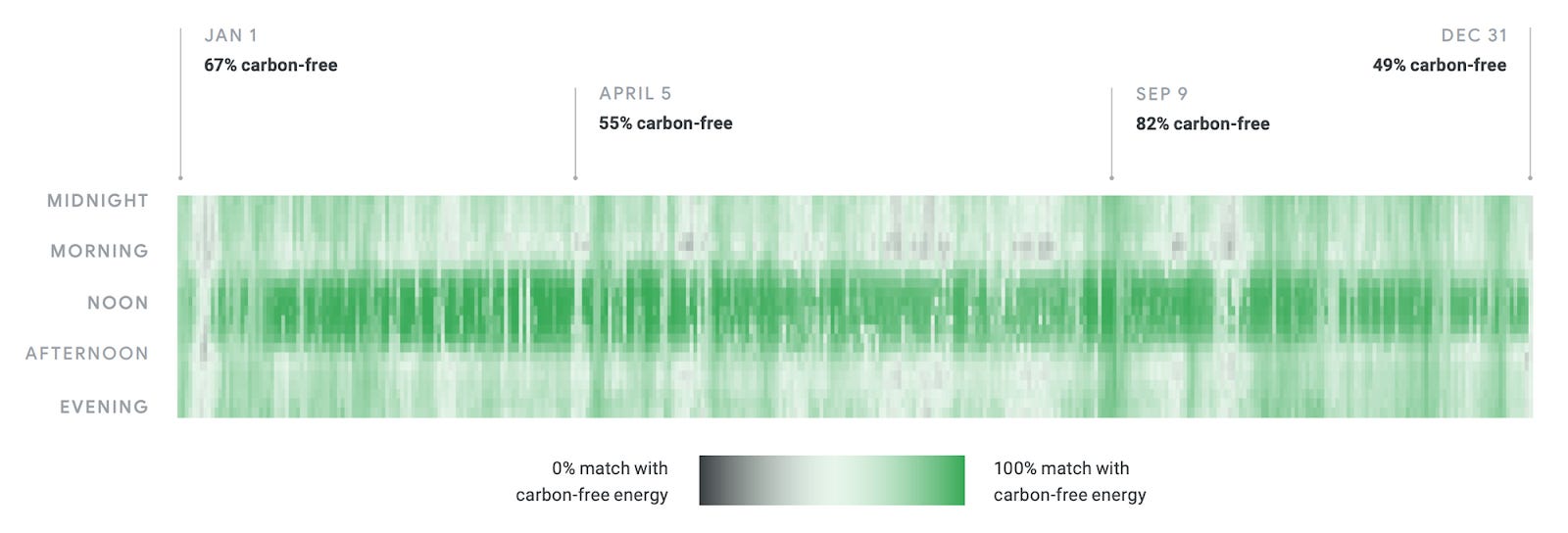
A benefit of the 24 x 365 diagram is the breakdown along the axes of time of day and time of year. Both are critical because the pathway to 100% clean energy runs through massively increasing solar and wind energy generation which are highly time dependent. While this framework makes visualizing the utilization of those two technologies easier, it also puts emphasis on the most important objective: Achieving 0 emissions from power generation at all times. The goal isn't just deploying 500 more megawatts of solar or closing down a specific natural gas plant, it’s about bringing each hour to 100% clean energy generation. Tactics should stay tactics while strategy is created to bring portions of the day or year to 100% zero emissions through any number of methods.
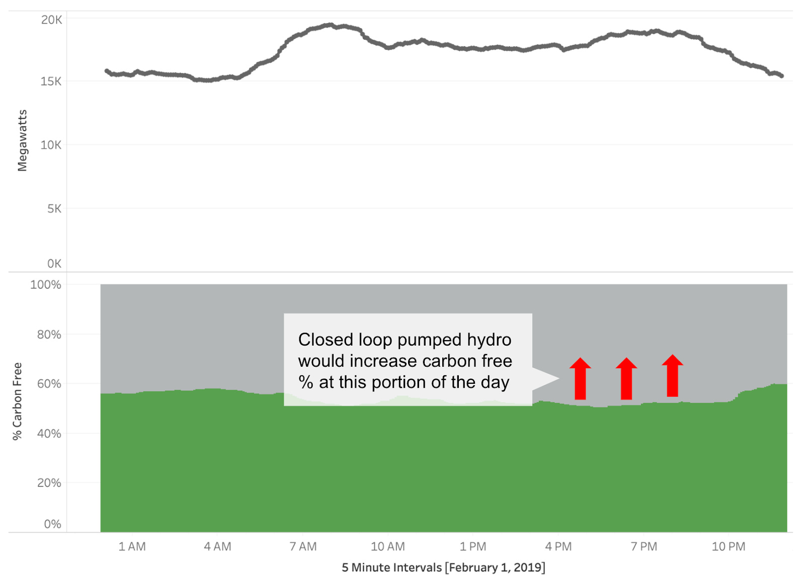
While useful on its own, the 24 x 365 grid is even better when paired with the ability to zoom in and observe the quantity and mix of power generated each day. These types of charts are common today among grid operators. NY ISO and CA ISO both have real-time dashboards of energy mix on their respective websites.
With the 24 x 365 grid and the per day breakout in hand, we can reason about what improvements would happen if specific actions are taken. Consider the following two examples.
Example 1: Adding more solar generation
Building a new solar farm would immediately allow afternoon hours during the summer to achieve a higher level of carbon free generation. Using the two visuals we can quickly see where a solar farm would provide benefits during the year as well as a specific day.

Example 2: Building a closed loop pumped hydro system
Closed loop pumped hydro systems can be thought of as very large water batteries. During the day water is pumped from a lower reservoir to a higher one using renewable or other energy sources. Then in the night water is piped down leveraging gravity to spin a turbine thereby generating power. This system enables providing non-intermittent power in the evenings across the year but especially in the winter months when shorter days make solar infeasible during the late afternoon and early evening.
Even tactics such as short duration battery storage and demand response programs can be visualized with this framework. Batteries can extend the window of operation for solar and wind by storing excess electricity production. A 4-hour capacity of battery storage can enable solar and wind to take on peak demand in the evening hours. Residential demand response programs, where customers are paid to use less energy during certain parts of the day, when mapped onto the 24 x 365 grid would also serve to make certain hours cleaner as fewer peaker plants would be needed to meet consumer demand. The per day breakout would similarly show a lower total quantity demanded and a cleaner mix of energy generation. These two visuals provide an easy way to conceptualize the effects of many different solutions all while keeping focus on the singular goal, 0 emissions at every single moment.
We collectively need to solve for 8,760 hours each year. Making each individual hour 100% clean will take a combination of technologies. What this visual framework provides is a map to gauge how far we’ve come and what remains. There’s a satisfaction that comes when checking off an item on a to-do list, we should consider this the same. 8,760 to-dos, some harder than others, but all equally necessary. I hope these visuals are used more broadly across the climate space both in the private and public sector.
Below I’ve created an interactive version of the 24 x 365 grid and per day demand graphs using data from the NY ISO in 2019. Hover the cursor over the 24 x 365 grid to see the breakout for an individual day.
Carbon Free and Fossil Fuel generation in the data:
Carbon Free consists of: Hydro, Nuclear, Wind, and Other Renewables
Fossil generation consists of: Dual Fuel, Natural Gas, and Other Fossil Fuels
Low hanging hours first
For any organization to have the most impact, the next step after constructing a snapshot of their 24 x 365 grid is to identify the low-hanging hours currently available. Low hanging hours are those hours of the day or year which are the easiest and cheapest to convert from fossil energy to clean energy. Depending on the geographic area that could be afternoons in July when the sun is always out and PV panels are readily available, or evenings in October when the wind blows continuously and turbines are relatively the cheapest. Not all hours of the day will be as easy or cheap to convert but emissions averted at 9 AM are the same as emissions averted at 12 PM. And in mitigating climate change, reducing emissions is of utmost importance.
On that last point, the advantages of tackling the low-hanging hours first are two-fold. One is that tackling those hours first preserves more of the “budget” of allowable emissions for the harder to clean hours of the day. The nature of climate mitigation is that emissions averted sooner are much more valuable than emissions averted later. A great illustration of this concept comes from Robbie Andrew who shows how far emissions must fall in each subsequent year depending on when we hit peak emissions in order to stay under 2°C of warming. Assuming priority can only be given to one initiative at a time, the low hanging hours are the place to begin. This isn’t exactly like a to-do list where the common advice is tackle the hardest task of your day first. In that sense it's the complete opposite, clean the easiest parts of the day first and leave the difficult parts of the day for later.
The second advantage builds off of the first. As the low-hanging hours run out, demand for fossil energy will only exist for those harder to convert hours of the day. As a result, costs for fossil generation will increase as the fixed costs of those plants become spread across reduced hours of operation. Higher costs for fossil generation will make more expensive clean generation technologies such as geothermal more competitive. Without this demand reduction based cost increase or a price on carbon, these farther out zero-carbon baseload technologies may take too long to become cost competitive. This advantage could be hobbled by factors such as contract terms, political lobbying, or subsidies to fossil power generators. All of which may limit how fast fossil generation costs go up. But at some point the market overrides all barriers. Cheap energy is cheap energy.
Armed with the 24 x 365 framework and a strategy of addressing low hanging hours first, any organization is properly equipped to start the daunting task of getting to 100% clean energy. With climate change every solution is needed, but at the same time we cannot forget the power of prioritization. Tackling low hanging hours first provides some sense of direction in a flood of possible actions.